
This article follows Part III in this series, Projections on Stage Part III: Choices about Screens

Projections on stage can be more than just a big square image behind the actors. They can be broken up, spread around, and appear in unexpected places on stage.
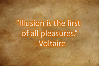
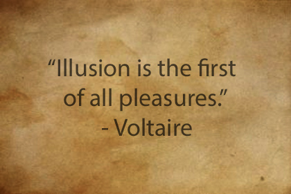
I have an old friend who is a director in my region. He contacted me maybe ten years ago, asking to borrow a projector just a few days before he had a show opening. They had an effect they were working on, and it was not reading well on their stage. I do not remember the show or the context, but they had a muslin screen that they wanted to look like parchment, with text that changed. They were having trouble because the projection was not reading well under the stage lights.
The projector I loaned them helped a little, but from our conversation, I learned that some choices had been made that were hampering their success.
- The screen had been dyed to look like parchment.
- The projected media had been edited to look like parchment.
- The screen was fabric.
- The installation was for rear-projection.

No one of these choices by itself is terrible. Taken all together, though? They assemble themselves, like Power Rangers, into a bigger, much more powerful problem.
- By dying the fabric, the brightness of the screen was reduced. Let’s be kind and say it was only down 50% in brightness. It was probably much worse. Brown is a notorious killer of lumens.
- By coloring the media, they also reduced the brightness. Let’s say another 50% reduction (probably more).
- Rear-projection screen material from a regular theatrical supplier transmits less than 50% of rear-projected light. Muslin is much worse. Lots of light just passes right through interacting with those linen threads and contributing to the image. I would imagine a gain of less than 10%, but we will be generous, and say 20.
50% x 50% x 20% = 5%
These factors string together. 50% x 50% x 20% = 5%. We are assuming best-case scenario on these steps, and the total brightness has been chopped down to less than five percent of the original. As I recall, they started with a 2000 lumen projector. They had the image down to less than 100 lumens – probably as low as 20 or 30. With stage-lights added to the mix, the image would still be visible, but it would be really disappointing.
In a previous post on this site, I included this video-article on how we see light and dark. It is pertinent to this discussion, so I am including it again here.
Let’s back up, and re-engineer this, in case someone wants to do something like this again later.
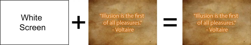
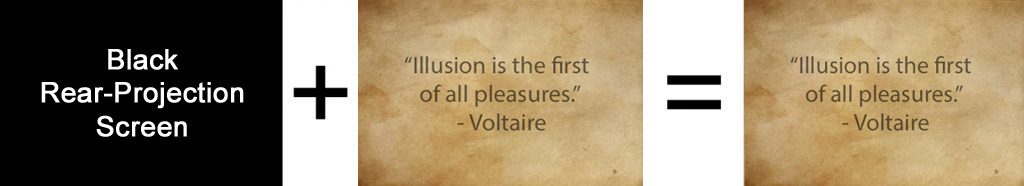
- If the goal is to create a parchment effect, we can do that either by coloring the screen, OR by coloring the media. It’s got to be one or the other; there is no need to do both, and doing both hurts us. Think of our lumens as money, We only need to buy the parchment effect once.
- What color do we want the text to be? It could be black. It could be white (glowing letters!). It could be brown. Or red.
- If it’s white or glowing letters, we could project onto a screen that is painted or dyed to look like parchment. Put the letters on a black background, and simply project the letters of light or fire onto the screen.
- If we want black or dark brown letters, then the screen around them needs to be boosted up. This might be a good situation in which to project the parchment texture itself.
If the screen is painted or textured, put black text on a white background and fill the surface.
If the screen is blank, make the texture and the text one image.


This works best if there is low ambient light. Front projection only.
Designing is always problem solving.
There are no right or wrong choices among these options. Knowing what the options are is important. Designing is making the best choice within a given set of circumstances. By understanding the screens and the media, though, you can solve the problem effectively and without stress.
Adjusting your media to fit the situation
Ideally, you can project anything you want, on anything that you want. The reality is that stage lighting, the screen, and a lot of other factors can hinder how your projections work.
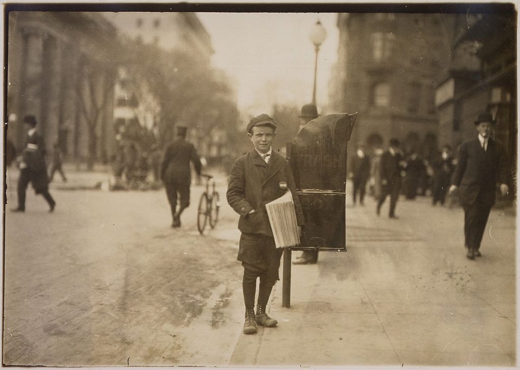
Lewis Hine [Public domain]
Some images are more difficult than others to project. Here’s a good example. This photo is busy. There are a lot of different dark shapes. Nothing is completely black or white. Everything is brown.
These are among the most difficult kinds of images to get to read well on stage. If your projection screen is catching ambient light, it might be difficult for your audience to know what this is a picture of. Subtle shades of brown can be especially difficult. On a good screen with a good projector, this would work fine. For something experimental, with a weird screen or a lot of ambient light, this sort of image might be best avoided.
High contrast media
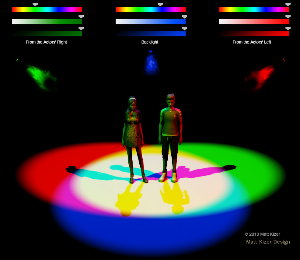
A given projector might be creating white light using a combination of red, blue, and green frames. Different projectors favor different colors. When you have an image that is just red, the projector is at best putting out about 33% of its potential brightness. The same is true for other primary colors. Secondary lighting colors like cyan, magenta, and amber often show up much better. If you are really concerned about the visibility of your projections, though, high-contrast black and white images are sometimes the best choice.
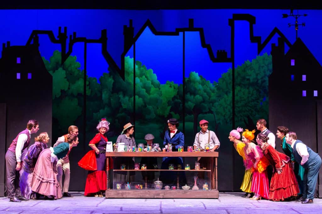
We had a good set of projectors for this production. In this image, we are rear-projecting onto a gray screen. The actors are very close to it, and it is catching a lot of stage light. The projector seems to do blues really nicely, and the greens are pretty strong. The bold colors and outlines make this a very strong still image.
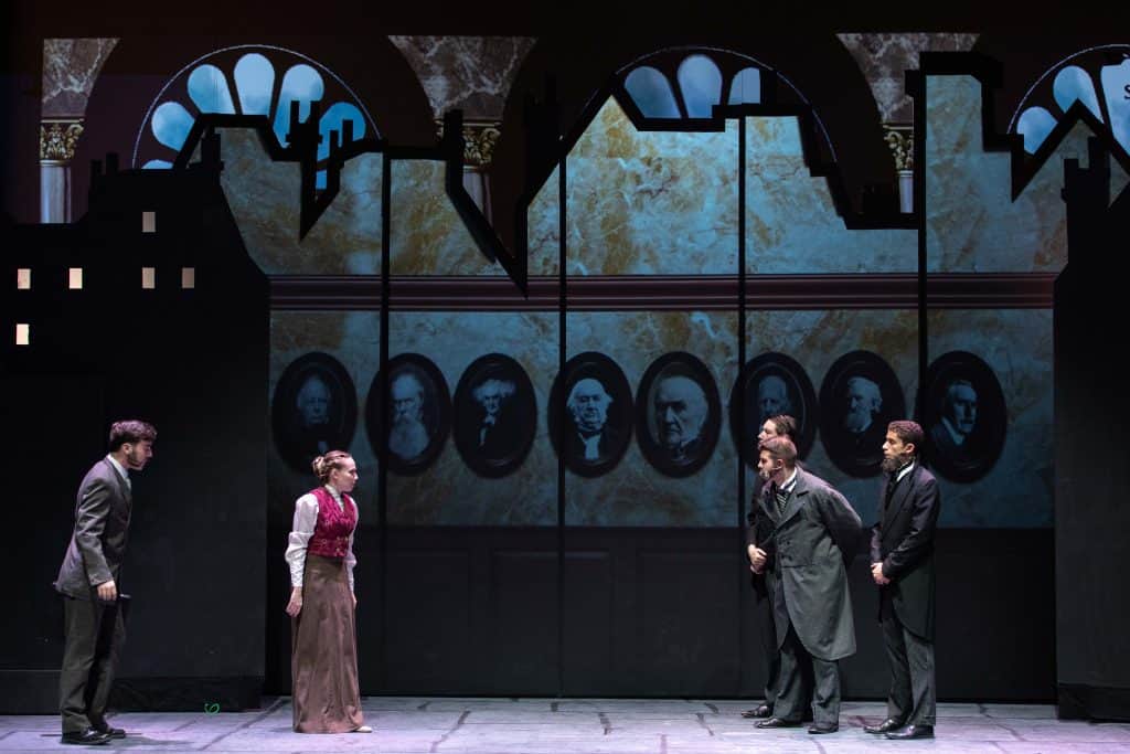
This is the same production This setting is the bank. Notice the wood panels running across the lower part of the image. The browns do not read very brightly. There are some highlights on the wainscoting that let us understand what it is. It’s working well, but it is at the threshold of usability. Some contrast or color adjustment might be needed if the situation were a little less ideal.

This one is a favorite of mine: Spring Awakening. Spring Awakening is a rock musical set in late 19th-century Germany. It is about school-aged children and sexuality. We used six ordinary projectors in the space. We wanted the space to be wide open. I suggested to director Morgan Murphy that we might create settings that look as if they are drawn with white chalk. We could project them on the walls of the theatre all around and behind the audience.

The director embraced this idea, and included it in the performance. The actors used chalk in some manner in almost any scene. They wrote on the walls and on the floor, leaving their work from scene to scene so that it slowly built up throughout the show. The chalk drawings that changed were the projected drawings. For each scene change, there was a slow, soft wipe that went around the space, gently replacing the previous setting with the next one, each one created entirely with projected chalk lines.

Chalk drawings are a great high-contrast choice to make. Photographic images would not have worked well at all projected on flat black paint. The chalk-drawings on black also made it easy to line media up. There were no visible projection fields to deal with.

Above is a photo from an outdoor dance piece. The media was animated. The tree was drawn rapidly in response to what the dancer was doing. The media was not subtle or sophisticated. It was bold and scribbly. We did not know quite what our lighting situation would be for this performance, so we planned for high visibility. The visual result was a high-energy and vibrant dance scene.

This moment from Brilliant Being is composed of looping clips of moving water. Each clip was chosen because of the high contrast light-and-dark textures moving within it.
When you have reason to doubt the visibility of your projections for performance, consider the visual style of your design. There are strong design choices that can allow your projections to punch right through the limitations. Political cartoons, star fields, Edward Gorey drawings, and many other kinds of graphics can let you use your very useful stock equipment without feeling like you are doing less than the best you can for your production.
Related: More Information on the Theatre Program at Plymouth State University
 Random Item